Vista Air
CHALLENGE:
With the increasing demand for air travel, it is crucial to create an app that simplifies the booking process and meets the needs and goals of users.
MY ROLE:
End to end process: discovery, user research, design, testing.
DATES:
August 2020 - August
The purpose of this UX case study is to enhance user satisfaction and streamline the flight booking journey through the development of a user-friendly Airline app.
This case study will outline the UX design process for the app, focusing on research, challenges, and recommendations to improve the user experience.

Problem
Navigating airline apps presents significant challenges, including difficulty finding desired information, uncertainty about selecting the best flights, and dissatisfaction with the booking process's complexity.
Solution
The solution is an airline app that aims to simplifying the booking process, enhancing price transparency, and improving overall usability. Through research, problem reframing, ideation, and prototyping, the goal was to create a seamless and intuitive app experience for users.
Research
Why: Understanding user’s behaviors and preferences when it comes to airline websites and apps is crucial for enhancing user experience and satisfaction.
What: Through a comprehensive research phase, which included user interviews, an online survey, and competitive benchmarking, I delved deep into the needs, goals, and pain points of users engaging with airline platforms. My objective was to uncover the nuances of user interactions and preferences throughout the flight booking process.
What I Discovered: My research revealed several challenges and concerns, such as the complexity of the booking process, lack of price transparency, difficulties with user interface and navigation, and a deficiency in personalized flight recommendations. Users expressed frustration due to tedious and confusing processes, highlighting a clear opportunity for improvement.
Challenges and concerns:
Difficulty finding desired information, including baggage options, fare options, and correct dates.
Uncertainty about selecting the best or cheapest flights.
Lack of clarity in indicating selected dates and duration.
Users repeating flight searches to find the cheapest option.
Dissatisfaction with the tedious, confusing, and poorly designed booking process, exacerbated by pricing changes.
Define
Why: In the Define phase, my focus shifted towards reframing the problem to ensure our design decisions resonate with user preferences and objectives.
What: After conducting user interviews and surveys, my next step involved analyzing the collected data to create an affinity diagram and a customer journey map. This analytical process enabled me to synthesize information, uncover key patterns, pain points, and potential solutions.
What I Found: Through the affinity diagram I identified common themes and issues within the user journey, providing clarity on where improvements were needed. Additionally, the customer journey map offered a structured visualization of the booking process, highlighting user goals, behaviors, and pain points at each stage. This analysis revealed crucial insights, including the need for streamlined structure and flow, clarity in information display, and minimalistic yet pleasing design.
Ideate
Why: During the design phase, my focus was on creating a seamless and intuitive experience for users from start to finish. By defining the user flow and crafting wireframes, I aimed to ensure logical navigation and clear information display, addressing user goals at each stage.
What: I first mapped out the user flow, detailing each step from the initial search to seat selection. This helped ensure that the full journey was represented and aligned with the insights gathered from the customer journey map. Next, I created low-fidelity wireframes to visualise the app's structure and layout. This allowed me to focus on logical navigation and information display without getting caught up in design details.
Sketches
Hand drawn low-fidelity wireframes to visualise the app's structure and layout, ensuring logical navigation and information display.
User flow


Prototype
Why: Prototyping plays a crucial role in bringing ideas to life and assessing their functionality. It allows for a hands-on exploration of the design's effectiveness and user experience, leading to valuable insights and improvements.
What: To test the effectiveness of the design in simplifying the flight booking process, I created a prototype using Figma. The aim was to provide users with an intuitive and concise pathway amidst the overwhelming options typically associated with booking flights.
Opting for a medium fidelity prototype, I prioritized functionality over visual elements to minimize distractions and focus on user interaction. This approach allowed for a more thorough evaluation of the design's effectiveness in guiding users through the booking process.
First Prototype
Wireframes
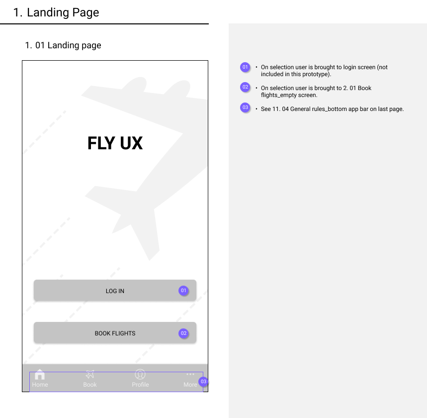
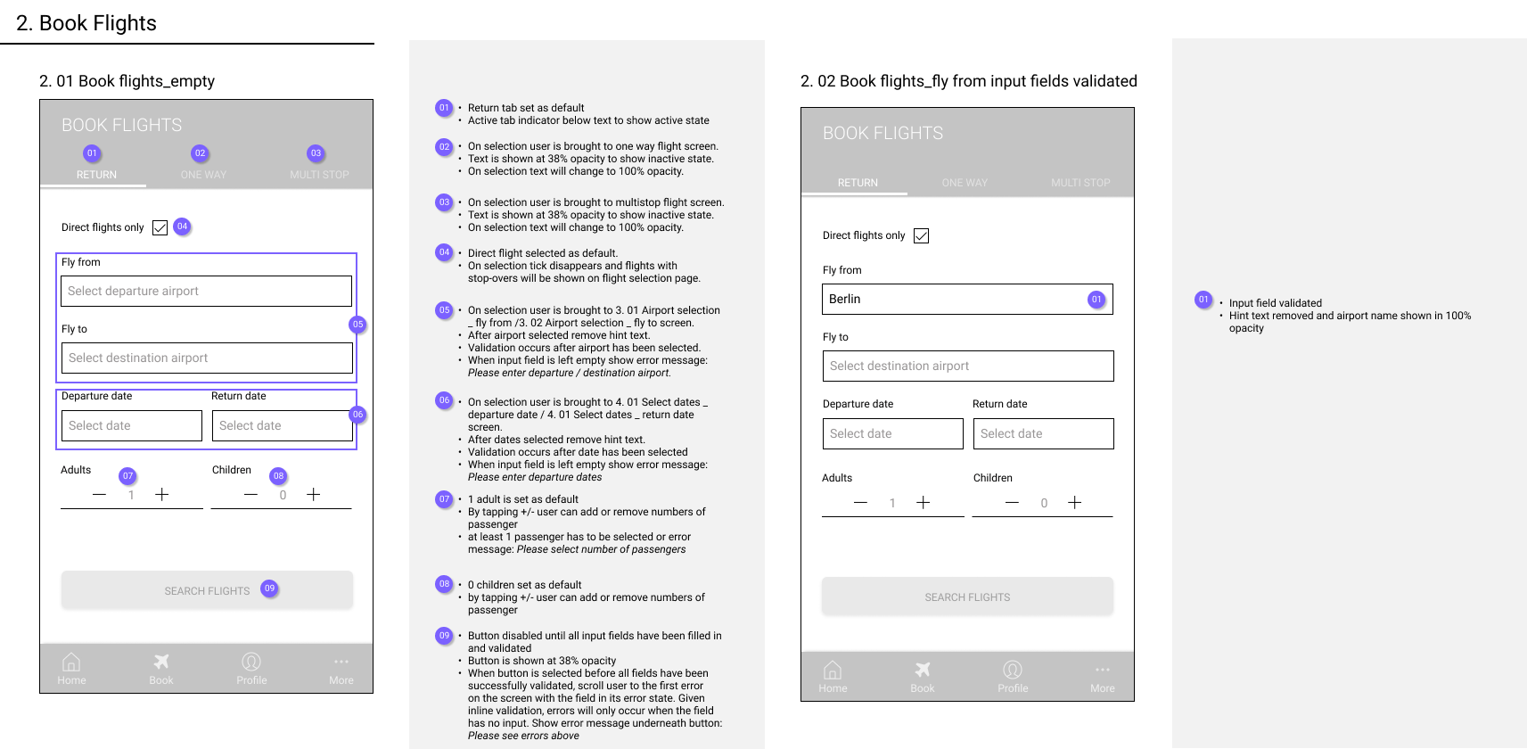
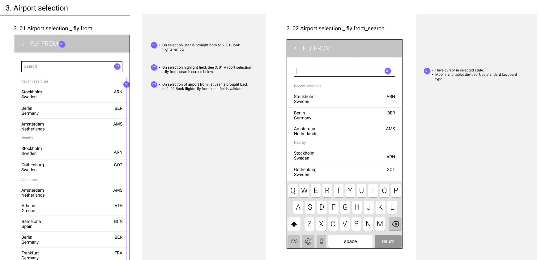
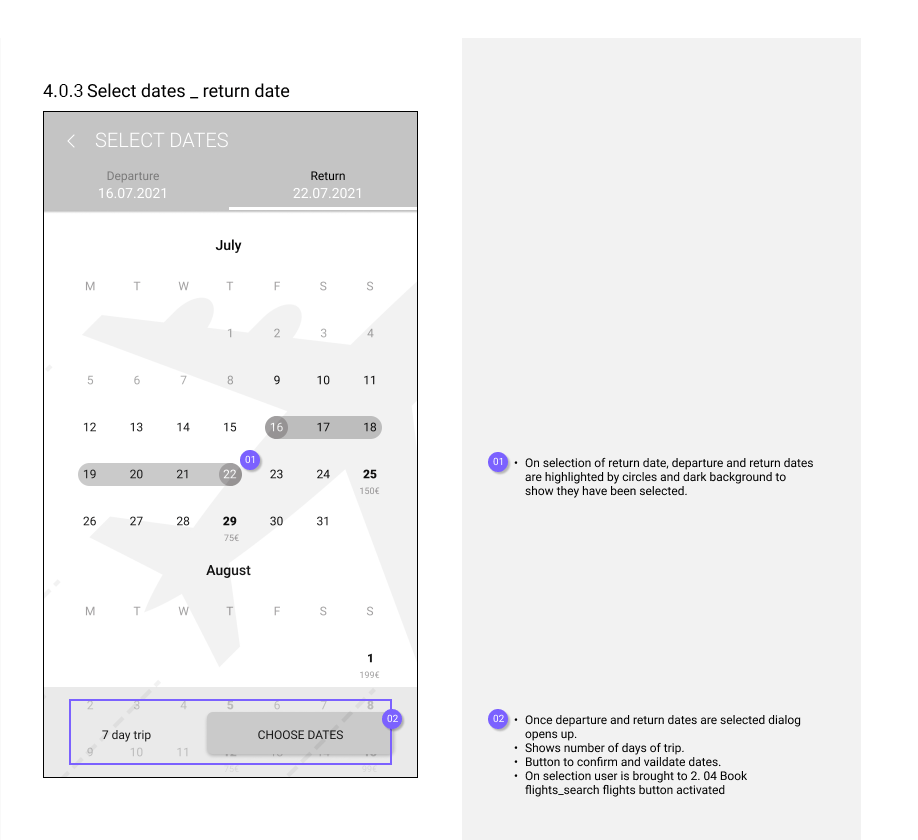
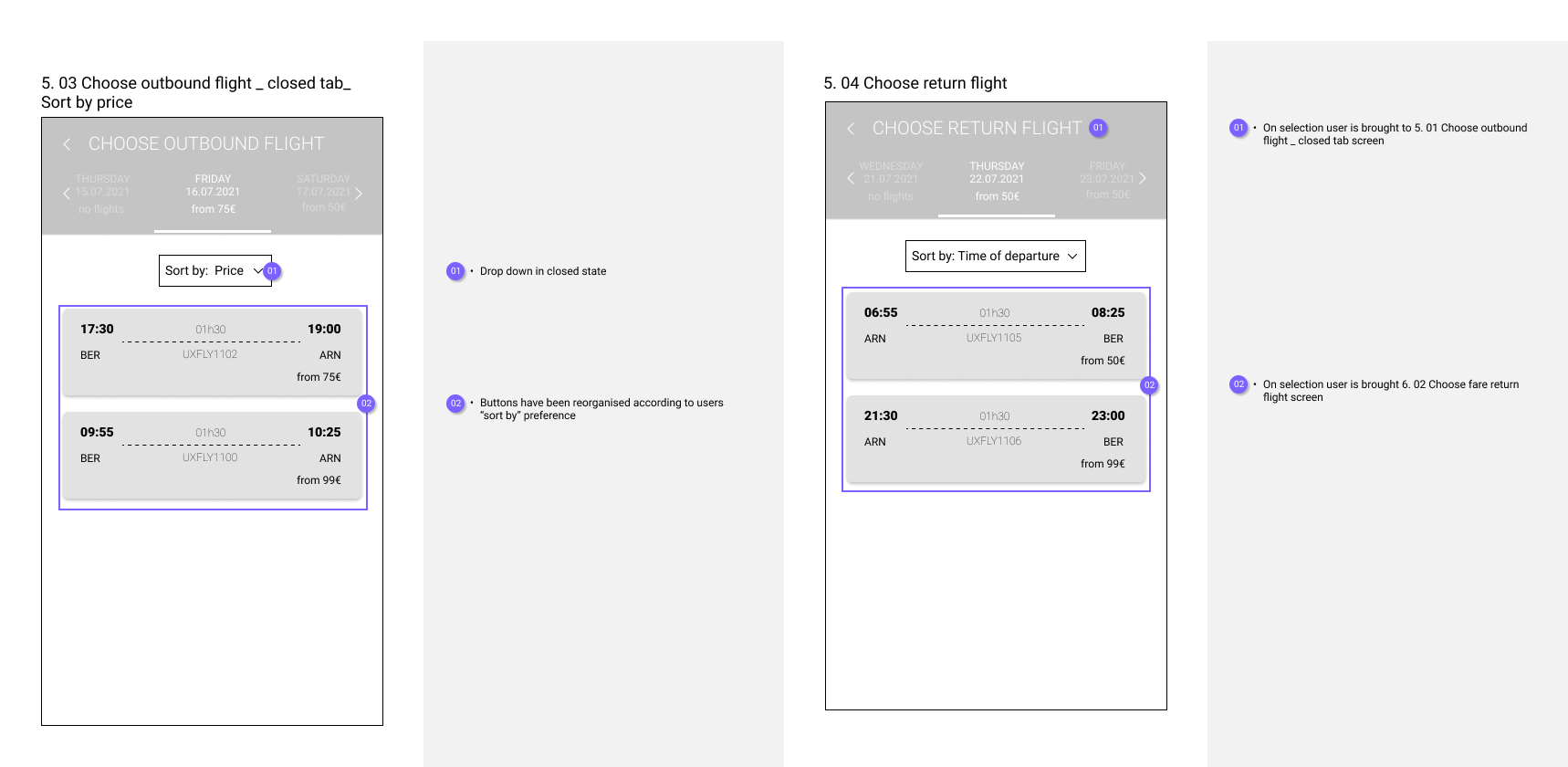
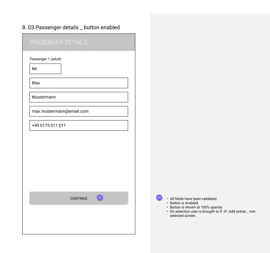
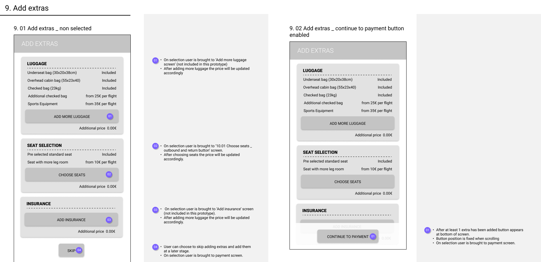
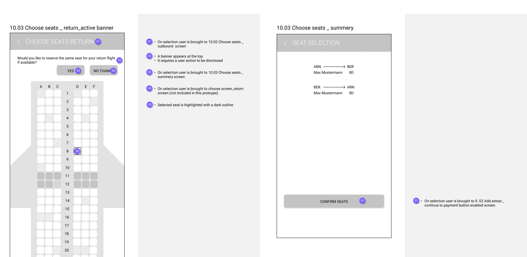
In the final stages, I thoroughly annotated each screen of our designs to provide detailed descriptions for the development team. This ensures a smooth transition from design to implementation. Additionally, I created a wireframe with controls and rules, organized for clarity and coded for easy communication between teams.







The outcome
What I Learned:
In my journey, I've discovered that understanding the user is paramount. Their thoughts, words, and actions often diverge, emphasizing the need for direct user input. UX is all about problem-solving and research, with research data guiding design decisions. The process isn't linear; iteration drives innovation, moving from design to prototype to validation and back again. Remembering "I am not the target audience" is key to user-centric design.
What’s missing:
I would conduct further research, considering not only core user needs but also accessibility and user enjoyment. Following this, the immediate steps would involve validating the design through user testing and incorporating feedback into further iterations. Additionally, collaboration with the development team would be essential to address any clarity or viability issues in the wireframes. This approach ensures that the final product meets both user expectations and technical requirements effectively.
After the course was finished i spent a bit more time on the UI of my prototype by adding colour, a Logo and visual elements.
